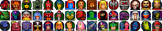
Gort's Icons
icons [ main | vol1 | vol2 | vol3 | vol4 | vol5 | hardware | he-man | palm | mac os x user pictures | amiga flavor ]

icon

Gort's Icons, He-Man

Nostalgia...

I was looking through IconPlanet's icon wish list one day. There were a lot of good ideas, but one in particular jumped out at me. Someone wanted He-Man icons...I suddenly realized, "So do I!"

A couple of months later, here it is. 45 "Masters of the Universe icons! Some are good...a few are great...and a few are really lousy, but it's been a lot of fun making them.

Between the actions figures, the comics that came with them (drawn by different artists frome issue to issue), and the cartoon, a lot of visual variations were produced. I didn't choose one medium to base these off of...it really depended on what I had at hand. So if you had the Zodac action figure, and you *know* the helmet wasn't that wide...there's your explanation. Also, the names may be a bit off...if you notice this, let me know, and I'll correct it. The backgrounds behind the characters provide both visual depth and more "grabbable area."

[ download ]
Mac | Windows | .GIF

He-Man
Not bad...I went with the long-haired version, rather than the short-haired action figure.

Teela
On the small side. I went with the princess style, instead of the snake-gear.

Castle Grayskull
I like it. I thought about putting the laser and flag in there, but hey.

Skeletor
Cool. The off-center pose is nice.

Beast-Man
A little rough...but you know, Beast-Man, rough, Beast-Man, rough. S'okay.

Ram-Man
Decent metal.

The Sorceress
Not much contrast, and Rod said it looks like there's a pink squid on her head.

The Swords
One of my favorites. I didn't expect it to turn out that well.

Tri-Klops
Pretty lame, which is unfortunate...he's a cool character.

Mer-Man
A little odd-looking, but not bad.

Orko
Good.

Moss-Man
Bad.

Snake Mountain
Also bad...that gray with purple is downright ugly.

Evil-Lyn
Not too shabby.

Trap-Jaw
I like the tilted head.

Man-e-Faces
I impressed myself with the shading.

Man-at-Arms
Ugly...it just doesn't look right.

He-Man's axe
Not amazing, but decent.

Spikor
A little off, but not bad, considering the subject.

Two-Bad
It was hard to get much detail in there and keep the two heads, so this one isn't all that hot.

Sy-Klone
Looks a little young, but who cares...it's Sy-Klone.

Mekaneck
Perhaps due to the size of the head, it looks a little out of place.

He-Man's Battle Armor
Pretty good...but it's not a head.

Hordak
Real cool.

Stinkor
It's alright.

Roboto
Decent.

Stratos
Not enough definition, but otherwise good.

Skeletor's staff
Good, but the dithering hurt it a little.

Modulok
Not too bad...if you like the head that's in front.

Leech
The head is pretty large.

Buzz-Off
Looks a little dorky.

Battle-Cat
A different pose might have been better.

Panthor
Nice...dithering is a little rough, but it gives it a bit of a fur effect.

Clawful
Terrible.

Whiplash
Goofy pose.

Fisto
Not much I can do with that one...I tried putting his huge fist in there, but it never worked out.

King Randor
I'd like a Whopper, please.

Mantenna
Ok.

Faker
...this one wasn't too hard.

Jitsu
Looks a little cartoony.

Zodac
...if only they all looked half this good.

Ninjor
Not bad.

Lodar's Kobold
Filler. Just a character from one of the comics ("Slave City).

Webstor
I like it.

Grizzlor
Great.

rejoice.

copyright Forrest Walter - www.forrestwalter.com